Sunday, November 21, 2010

WEEK 12: Pollock's work of art


Number 1 by Jackson Pollock, 1949, 5'3"*8'6", Museum of Contemporary Art, Los Angeles.

At first look, the painting looks like a mutlitude of curved lines, arcs, spots everywhere: green, yellow, white and colors in that tone.

To create such a painting, Pollock had unstretched canvas on the floor and painted on it directly, from above, with precise gesture. The painting was already in his mind, he only had to reproduce it and could not be stop in his process. It was like a transe, he knew precisely what he wanted to reproduce and dripped the paint on the canvas with no hesitation.

The purpose of Pollock's painting was for people to lose themselves in the contemplation of  his work, to forget about the outside world, see and imagine whatever made us feel better out of it. Pollock's work is indescribable but full of energy, of emotions that comes toward us in a wave. He is to me one of the most unexpected artist of this century and one of the most talentuous: indeed, he is able to transmitt emotions through a work that, from an outside cold look, looks like nothing when it is everything.

In his unapologetic materialism there are refreshing and unregenerately American qualities, as there are in his effort to breathe spirit into the refractory matter he chose to make the substance of his art. These distinctly native qualities mix matter-of-fact realism with respect to materials, and an innocent idealism. Only a supreme innocent would have felt free to disregard the intrinsic appeals and cultivated uses of the language of paint, and gambled with raw pictorial effects to the degree that Pollock did. And only an idealist of transcendent powers could have won from such patently non-artistic content a deep and moving lyricism.

Jackson Pollock
Sam Hunter, Jackson Pollock, Bernard Karpel
The Bulletin of the Museum of Modern Art
Vol. 24, No. 2, Jackson Pollock (1956 - 1957), pp. 3-16+18-19+21-36

Monday, November 15, 2010

Week 11: The colorful art of Andre Derain

View of Collioure 1905 by Andre Derain 26*32 3/8" Museum Folkwang, Essen, Germany

This painting is a representation of a small port on the Mediterranean coast in the south of France called Collioure. First in front of us there are weath fields borded by trees typical to this region: Tall with leaves only over their top that give an impression of them wearing a hat. In the background, we see a town with its houses and red roofs. One of the buildings seems to stand out more than the others, and its shape might suggest that it is a church. Eventually, behind the houses is the dark blue see that differentiates itself from the lighter blue sky. On the top right of the painting, between sky and sea we can observe the outline of an hill diving into the water. The drawing is colorful, balancing between warm colors like yellow, red and orange that confuses eyes between the wheat field with the village and the green and blue hues of the trees, water and sky.
The artist uses an all new technique of painting at that time: he mixes teh Pointillism of Seurat but add a touch of freshness in it by making it less strictlike. Indeed, Andre Derain was also inspired by the work of Van Gogh and Gaugin: the vivid colors and the thicker "points" (if, in fact, they can still be called points).

Also, Derain did not paint this to give a realistic representation of what he saw. For instance, the colors are certainly not accurate to this landscape. He painted this in hope to transmitt his feelings, the warmth of the sun, the shinning light that it produced, the breeze and the smell coming from the sea. His purpose was not to make us look at the painting but to invite us in a voyage to this place, to influence us to enter the painting and lives it with all our sensations: taste, smell, sounds of the crickets.. Through his art, Andre Derain hoped to bring us to a better place for a little while, that would last as long as we contemplated his painting. And indeed, being from France, i personally feel like taking a trip back home through this image and it brings in me warm emotions. The purpose of the author's work is then fulfilled.

[View of Collioure] by Derain, rarely or never before seen in this country, surpass the promise held by reproductions

The Wild Beasts -- Fauvism and Its Affinities at the Museum of Modern Art
Henri Dorra
Art Journal
Vol. 36, No. 1 (Autumn, 1976), pp. 50-54

Sunday, November 14, 2010

Week 10: Graphics manuscript

Bahram Gur and the Princess in the Black Pavilion 1538 from a manuscript of Hatifi's Haft Manzar, Bukhara, Freer Gallery of Art, Washington, D.C.

This painting is a minature from a manuscript. It seems like it is divided in two parts and the down part is divided again in two parts. In the part at the bottom, there are four characters that seem to be visiting: two on the left are examining a paper while drinking a few beverages that are present in front of them and two on the right seem to be playing instruments while enjoying oriental beverages also. At the center of the representation are the two characters: they are slightly bigger than the other ones. On the left there is a man serving a beverage which seems to be tea and on the right a woman sitting on a pillow and apparatenly waiting for her tea. Her head is turned toward the man as if they are conversing. I suppose they are also visiting. All these characters are sitting on a carpet and oriental objects as candles and dishes are gathered around them. Then in the top part, there is a huge door and at the top of this door a window. From this windown, a woman seems to be hiding behind a curtain, observing the scene below her. The entire painting is colorful and full of details as for the carpets and the walls.

The artist has realized here a work with an isometric perspective. Indeed, there are no converging lines or fixed points and the viewpoints are aerial and earthbound combined so that the scene can be depicted in its totality as God might see it. This representation has a religious purpose, it is here to illustrate a story present in a religious manuscript. Indeed, it is also dreamful and help the author telling its story through imagination and dreams.

"[...]The miniature is of very high quality, and the treatment of the dome and pavilion, with the designs picked out in gray and white, is original and effective."

Prince Bāysonghor's Niẓāmī: A Speculation
B. W. Robinson
Ars Orientalis
Vol. 2, (1957), pp. 383-391

Sunday, October 31, 2010

WEEK 9: The exceptional light of Pierre-Auguste Renoir


Le Moulin de la galette 1876 by Pierre-Auguste Lenoir 4'3 1/2" * 5'9"  Musee d'Orsay, Paris

This painting is the representation of a party going on in the 19th century. People are in France, entertainning in the neigbourhood of Monmartre in Paris, on a Sunday afternoon. Closest to us are women conversing, men drinking and smoking. In the background, there are dancers, a couple particularly on the left attract our attention because it is a little apart from the other dancers. There is a crowd dancing, visiting, going to a cafe in the back. There are trees all around them that create an atmosphere of happiness and calmness by playing with the sunlight.

This painting was one of Renoir's happiest work of art. It also is the first painting in which with see this kind of light. Indeed, Renoir tried reflecting a dancing light, as we found it aroudn us, in nature. Before him, light was always represented as still, which was not the case out of the painting. Also, depending on the intensity of the light, objects were not always clear as they are in most painting. Especially with shadow, forms become more blurry, as if in a dream. Indeed, Renoir had to invent a new technique of paintign to express all these sensations provided by the light around us. And that is how impressionism was born. For the first time, a painting could capture and transmitt the sensations of perception. As in here, Renoir used his full Impressionist technique to create a work as in a picture: it captured a moment in time, with its emotions: there is color, movement and light surrounding us as viewers as if we were part of this scene, looking at it outside of the window or just contemplating the joy of this scene, drinking a wine of good glass and enjoying the sun and the company of others. This personally is one of my favortie painting. It express so much in an instant, transport us among these people that are happy, enjoying life and not worrying about a thing. The work of the artist is fully accomplished because it brings happiness and hope of happiness in a world that has became more and more complicated with less and less simple pleasures. This painting, throughout time, reminds us that there is happiness in this world, right by our door, everywhere and anywhere.

The new relationship of the figures, the tonal co- ordination, and especially the projection of the dancers to an impressive scale marks a decided ad- vance over the earlier compositions. Yet a spiritualaffinity binds the three celebrated painting,[...].

Title: A Great Renoir
Author(s): James S. Plaut
Source: Bulletin of the Museum of Fine Arts, Vol. 35, No. 209 (Jun., 1937), pp. 30-33

Sunday, October 24, 2010

WEEK 8: Ceiling images by Michelangelo

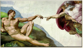
Creation of Adam 1511 by Michelangelo, detail of Sistine Chapel ceiling

In this painting, there are two main characters, God and Adam. Adam, on the left, is laying on an hill. He looks absent because his body is entirely formed, as its naked representation shows us, but still lifeless. On the right, God seems to fly toward him. He is accompanied by many other characters that are gathered around him. They are angels from Heaven. Howeverm one of them appears particularly strange to our eyes cause it is a woman. The story says that Michelangelo wanted to represent Eve by God's side, under his arm as his protected child. Indeed, Eve had not been created at the moment, she was still an idea in God's mind. Another personnage attract our attention inside this group: God points at a child in particular who is, in Michelangelo's work, the Christ who has not come on earth yet. But the main point in this work of art is the two hands reaching for eachother, almost touching at the point, the one of God which is aiming for Adam's and Adam's which is just standing there. The difference is significant too between God's look which is concentrated on his chore, bringing the spark of life inside this body, Adam, to live and the empty look of an inanimate Adam.
The symmetry is so perfect that the end of each finger is pointing at the center of this piece of art. Indeed, Michelangelo wanted to reaffirm that God created humans at his image, as if there was a mirror in this picture reflecting God's personnage in Adam's. Also, the painting is concentrated on a few colors: red stands out as envelopping all the characters from Heaven and God is dressed in a pink robe as to be differentiated from the other bodies. The pale pink color of Adam's body stands out by itself on the green grass around him. 

Michelangelo was a talented painter whose work will never be able to be reproduced by anyone again. All his life, he worked for popes and other nobilities as kings but he concentrated his paintings and sculptures to religious theme as in the Sixtine Chapel. He always tried according his ideas and beliefs to what his masters asked. As in this piece, he gave his own interpretation of the Biblical story from the Book of Genesis in which God the father breathes life into his first creation, Adam, the first man. And his interpretation is believed to be realistic and the best physical representation of this Biblical story. Indeed, Sistine Chapel is one of the most visited place on earth nowdays, and all thanks to the work of Michelangelo that depicts an impressive illustration of the Bible, found nowhere else around the world.

Michelangelo had full or nearly full freedom to select the episodes to be included, it may be supposed that it was his own idea to use a passage from the Book of Proverbs in The Creation of Adam. Perhaps it fascinated the artist-himself a poet-with its rare beauty, and in his ravishing portrayal of Divine Wisdom on the Sistine ceil- ing, he created a worthy equivalent.

Title:  The Divine Wisdom of Michelangelo in "The Creation of Adam"
Author(s):  Maria Rzepińska
Source:  Artibus et Historiae, Vol. 15, No. 29  (1994), pp. 181-187

Tuesday, October 19, 2010

Religion views by Duccio

Christ Entering Jerusalem, detail of Maesta Altar 1308-11 by Duccio 40*21" Museo dell'Opera, Siena.

In this colorful painting, we see the Christ with his disciples coming into a city. A crowd seems to be awaiting the procession with offerings, branches of a saint plants. There are kids which look excited, and elder men that look more solemn, two of them holding their hands whether in sign of respect and disagreement. But i would rather think respect since this is a work of art to the Christ and to show his magnificence. Two men even climb in trees to reach the branches of the sacred trees to bless the Christ and his group with them. In the background, at the top of the painting, there is a church standing there, which is probably the Christl goal.

The athmosphere of the paintings give a sense of space, a certain athmosphere which is particular to religious painting. Indeed, to celebrate the Christ, the artist decided to realize a painting with a sense of space and movement. Indeed, the way Duccio has designed them, the people seem actually to be moving and expressing the admiration adn their impatience in the crowd for instance. And the fact that he was able to put so many crucial details that lead the way from the Christ to the church create a picture so real. Indeed, the work of art is an impressive proof of the importance of church. The Christ attract our eyes by his posture over the dunkee and by the gold circle around his head. And that it exactly what the artist tried with lines and diagonales. He wanted the viewer's look to focus on the Christ, to express how central he is in the artist's religion and life and how he should be in ours. This painting is an unique contribution to the recognition of God in religion. It effectively transmitt the message that Christianity wants to convey.

This was Duccoi's novel, almost unprecedented, contribution to the art of the period, the use of architecture to demarcate space rather than to act as a simple backdrop.

Title: Toward The Renaissance
Source : Living With Art p. 391 (Eigth Edition) by Mark Getlein

Sunday, October 10, 2010

The mystery of Lascaux

Horse and Geometric Symbol 13,000 B.C.E, Cave painting, Lascaux, France. 

This work of art is a paint of what looks like a horse with some other signs around it. The designs are pretty simple, primitve, which seems logical since this was made 13,000 years ago.

As we saw in the video, the artist painted a horse that he probably saw when being in a transe or jsut being in a cave. The confused geometric signs probably appeared to him too, as it is a reaction to the brain that appears to the human eye while unconscious or staying for too long in a dark place. Indeed, horses were assimilated to gods in the people's mind at this time because they were sacred to them and that is why they were the main animal painted, because they materialized to them in the first place.